The wooden button is gone — the dice are the button
· design · game
In the morning Pipfold looked like a board game with an app around it: an orange “Two dice” button across the felt, lines of text above and below it, a white card with settings in front of it at startup, a window with the result at the end of a round.
All of it worked. And all of it stood between the person and the thing.
First: the dice throw themselves
An orange button labelled “Two dice” lay across the green felt. Next to it lay two dice that did nothing.
That is the inverse of what happens at a table. You do not reach for a button in order to throw dice — you reach for the dice.
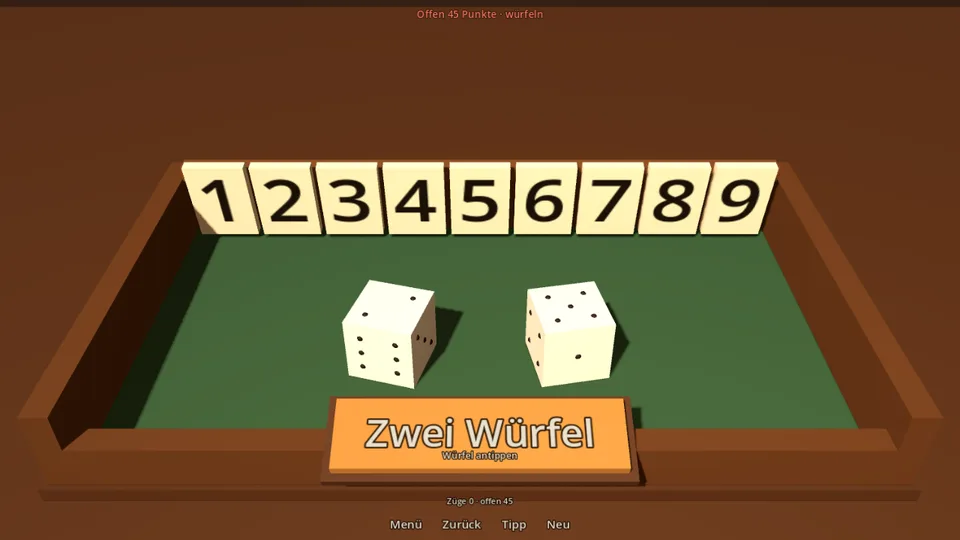
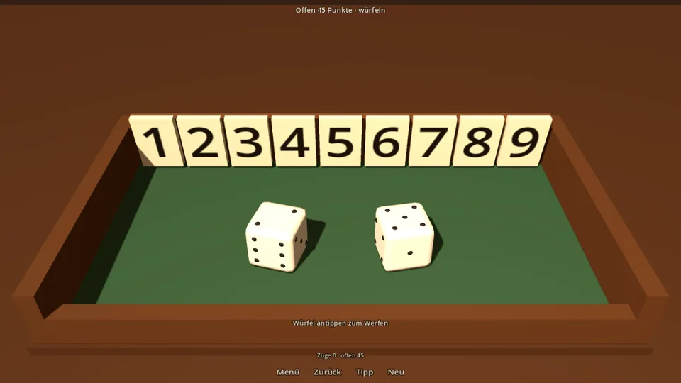
The lines of text at the top and bottom are still there in the right-hand image — they fell later the same day, along with the menu and the popup.
Now a tap on the dice throws them. The button is gone, unreplaced. For that to carry, the dice first had to become something you want to touch: rounded edges instead of sharp little cubes, weight in the throwing arc, sunken pips instead of painted dots, two bounces and scatter on landing.
A control that looks like an object has to behave like one — otherwise it is a button in costume, and that is worse than an honest button.
Second: the menu runs in front of the real box
Before, a white card lay over the image at startup with the choice of variant. You picked “flaps 1–12, three dice”, pressed “Play”, and only then saw what you had chosen.
Now the menu sits in front of the running box. Switch to 1–12 and you watch the row get longer and the third die appear. The preview is not a depiction of the choice — it is the choice.
Fine settings live behind it under “More settings”. What you need the first time is at the front; what you change once in your life is at the back.
Third: the round end without a window
A popup used to appear with the result and a button. A popup is an invitation to dismiss it — and behind it lies the box you were just looking at.
Now the result floats in, without a frame, without a button, and it arrives later than the end of play. Between the last move and the number there are two seconds in which nothing happens except the box, standing there.
Those two seconds were the most contested change of the day, and they are the reason the game feels calm. The hint stays usable during them, incidentally — you are allowed to check whether nothing really was possible.
Fourth: almost no interface left
What remains is one line at the bottom (what to do), four symbols at the top left (back, hint, new, menu) and the open score at the top right, opposite them.
The split is not taste but a rule: what you touch at the start of the line, what you read at the end. You reach left, you read right. Everything else is wood.
Rejected: making the buttons nicer. The obvious move that morning would have been to design the roll button better — wood grain, a drop shadow, a click. It would have become a very handsome button, and it would still have stood where the dice lie. The goal is not a good interface but none.
The touchstone
This day produced the question every idea for this game has been measured against since — it mattered again later, at the moment of victory:
Not “does that look good?”, but “could the object do that?”
A wooden box has no buttons. It has flaps, dice and hinges. Everything the game can do has to follow from those three things — otherwise it does not belong in it.